Studio KNest uses clever tactics and creative insights to craft a pleasant highly-functional home for a young couple.
Curated by: Deepa Nair
Photographs: Nowadin Sttudio; courtesy Studio KNest
 The brief
A tight 464 sq ft space, and an exhaustive list of requirements were handed over to Studio KNest — headed by architects Nidhi Bhatt and Kunal Gupta — when they took over the assignment of designing this 1BHK Mumbai apartment. The clients wanted a minimally designed functional home with neutral colour palettes; and were also open to experimentation with geometry and materials. Further, instead of a dining corner, they requested a mini bar cabinet; and a multi-functional area to be accommodated in the additional room attached to the kitchen. The clients also wanted the independent bathroom and washroom to be clubbed together to form a single unit. Additionally, they also requested a powder bathroom to be attached to the bedroom.
 The design intent
The young architects adopted the well-known “less is more” theory to create spaces which boast of simple geometry, neutral colour palettes, highlighting textures and smart storage solutions. “We wanted to achieve maximum by keeping the design elements subtle and crisp,” explain the architects. “We wanted to break the myth that be it a large scale project or a simple 464 sq ft apartment, elegance and luxury can be achieved in both when you have the passion for smart design and details. We also ensured that the design would adapt to the changing needs of the users,” they add. As this household had pets, special care was taken by the creators to avoid sharp edges in all the tailor-made pieces used in the apartment.
 The design and material details
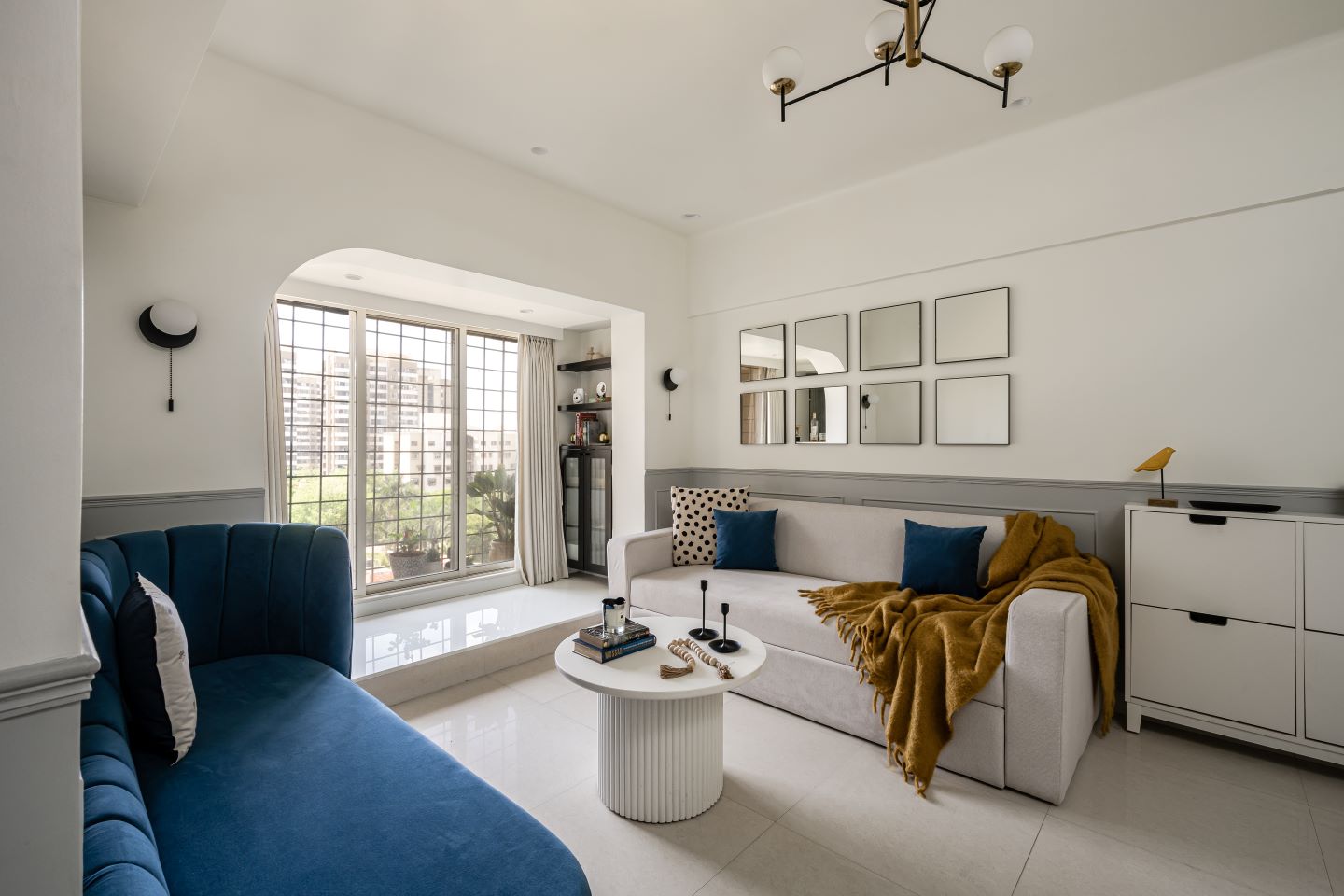
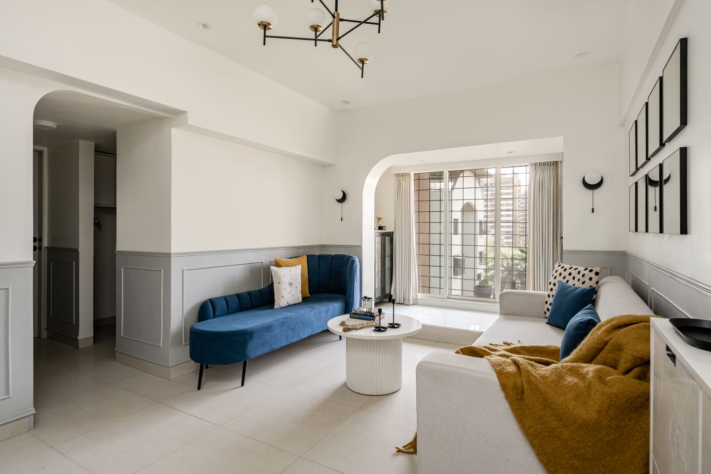
Nidhi and Kunal decided to break the routine linear geometry in the living room by introducing curves (read “single-sided” arches) which merge with the walls. As soon as you enter the apartment, a stark single sided arched frame catches your eye. Passages are the most neglected spaces so to blend with the living; the one sided arch was repeated at the passage opening too. Another major element was mouldings that ran up to 42” height from the floor throughout the living room. They were painted in grey tones to complement the white walls.
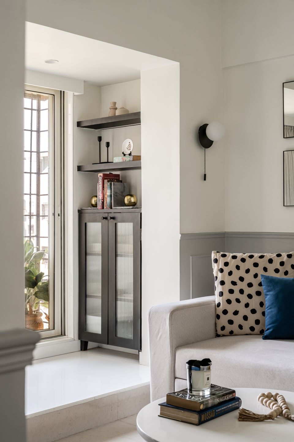
In the living room a piece of furniture the architects keenly designed was a dramatic love seat in royal blue fabric. Other pieces of furniture like the TV unit and centre table had curved edges too and were finished in duco paint to match the arches. Additionally, a sofa cum bed is placed here to compensate for the lack of a guest bedroom. A small bar cabinet in black laminate is given at the far end with a small opening above it from the kitchen. Mirrors have been used in spaces where it can reflect maximum light and add to the decor. A long planter, clock and artefacts add highly to the look and feel of the room.
 In the kitchen, the existing flooring was retained, and sea blue brick highlighter tiles were used on the walls, with a black granite counter top to balance the look. As the multi-functional room (which accommodates a study, pooja and storage) is connected to the kitchen, the architects wanted to design a partition that doesn’t seem too heavy, but still act as a visual barrier — the solution was a fluted glass black framed folding door.
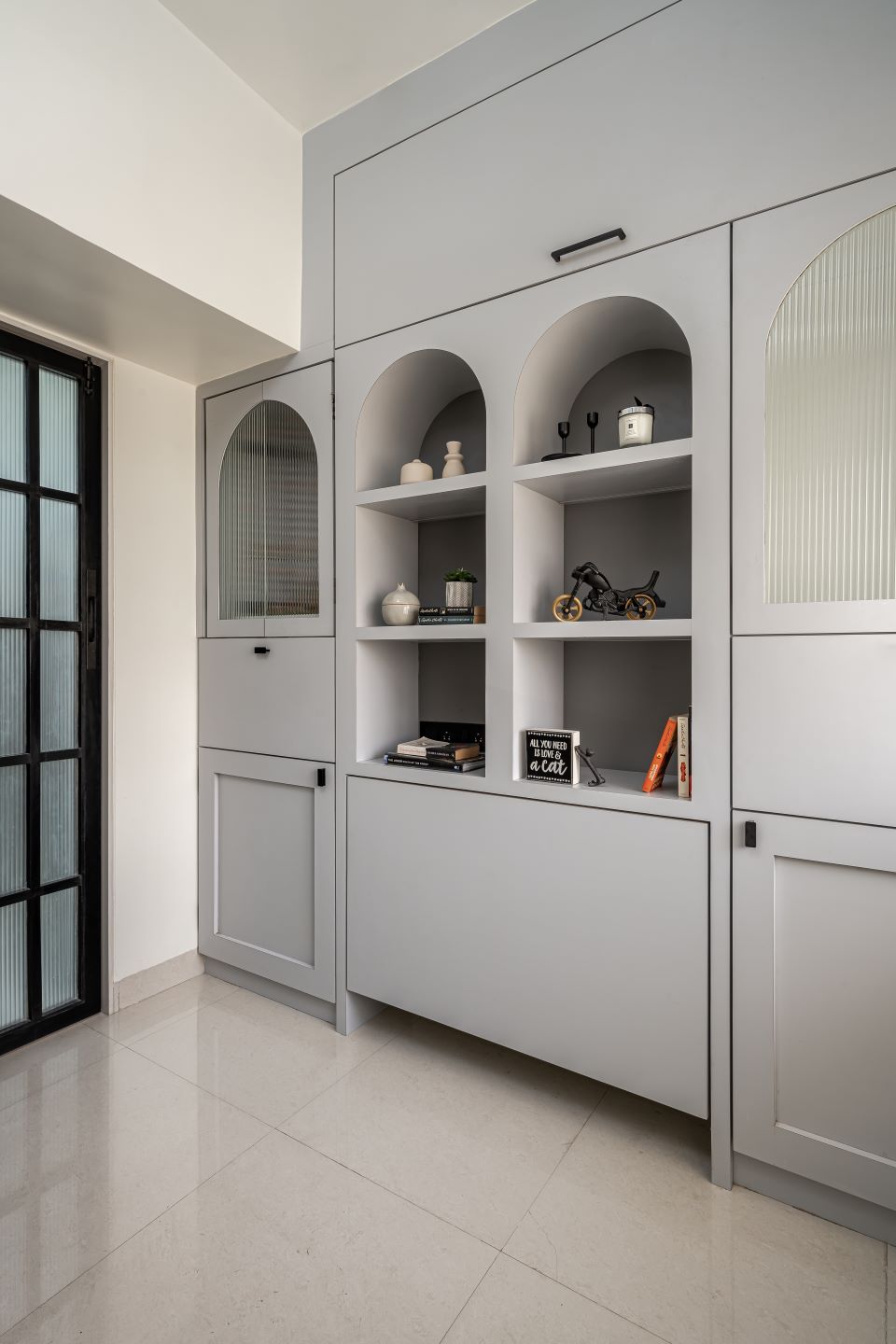
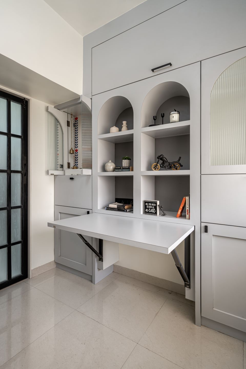
A smart piece of multi-use furniture designed for this tight space stretches across one wall of this room. “The idea behind creating this unit was to provide a storage solution that is aesthetically pleasing, and also accommodate a number of utilities,” says Nidhi. “At first glance it appears like any simple unit with niches to display artefacts, planters, etc. But it has an inbuilt study table which can be opened and used when required. The client also wanted a small pooja so we incorporated it within this unit by using a pocket door fitting. The unit also has enough storage for keeping day to day usage items,” shares Kunal. Across this versatile unit a photo wall, and a low seating (mattress) to enjoy the view from the window is placed.
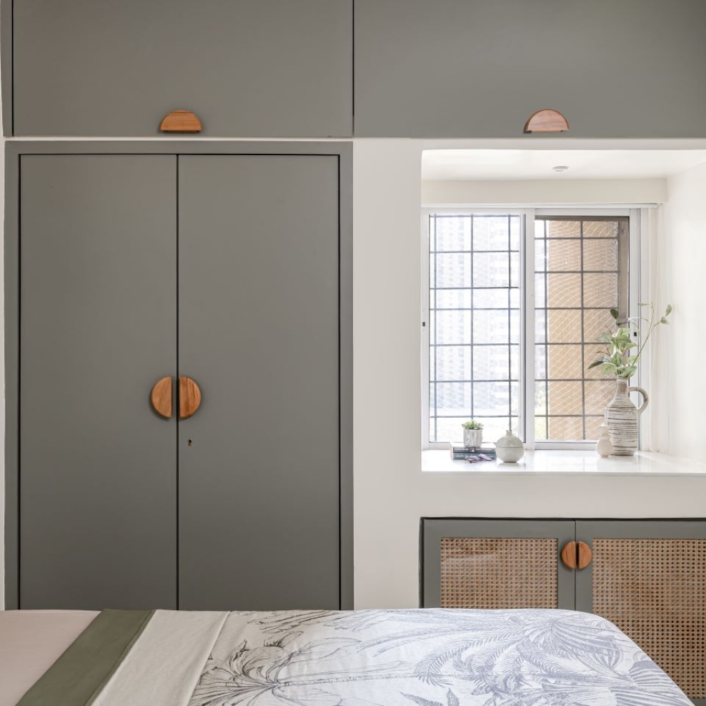
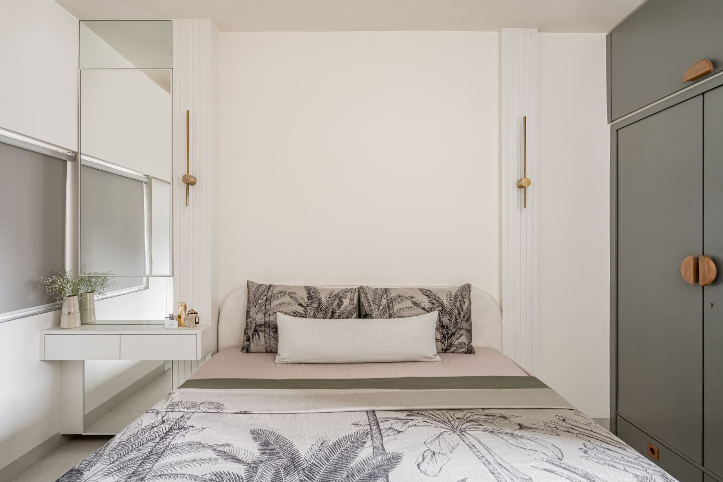
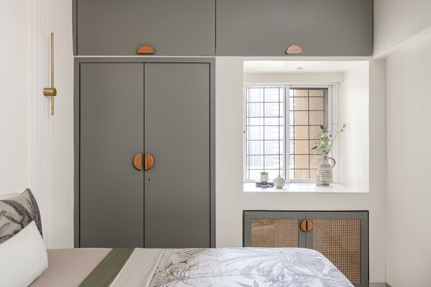 In the bedroom, the architects have tried to create the right balance between minimal design elements and a sharp and crisp geometry of space. Here, the furniture (bed and dresser) is kept white, with highlights of kota green and rattan laminates and wooden handles. A cosy sitting area is also provided near the window. The powder toilet attached with this room features salt and pepper wall tiles and green kota tiles on the flooring in continuation to the bedroom theme. A highlighter BTC moulding runs at four feet height to add to the decor.
The common bathroom is made in black, white patterned and grey tiles. A back-light mirror makes the toilet look spacious. The architects consciously chose Kohler’s matte black sanitary fittings to enhance the monochromatic look of this bathroom.
Fact file
Project: The Minimal Nest
Clients: Nitish Parab and Neha Talreja
Location: Mumbai
Area: 464 sq ft
Principal architects: Nidhi Bhatt and Kunal Gupta
Add a Comment