Studio Dangg curates a space conducive to casual conversations and mirth over endless courses of food and drinks whilst capturing the essence of Japan’s age-old street bars at Gonzo.
Curated by: Deepa Nair
Photographs: Niveditaa Gupta; courtesy Studio Dangg
 The site
Gonzo designed by Studio Dangg is an unorthodox retreat nestled in a newly rediscovered and revamped urban marketspace of New Delhi. Aesthetics splashed with pan-Asian flavours, the design is firmly rooted in the idea of bringing the vigour of izakayas (informal Japanese bars) to the capital.
The brief
The design brief was to create a space for casual dining that would unabashedly celebrate the cuisine that it houses. Hence, the overarching design intent was to draw a parallel between this urbane establishment and the street bars scattered across south-east Asia. The space was to effortlessly transition from being a bistro fit for a quick catch up over lunch, to a speakeasy in the evening, perfect for energised conversations over drinks post work. The ambience of the bar was to remain easy-going and unpretentious, silently encouraging patrons to settle in and lose track of time.
 The design intent
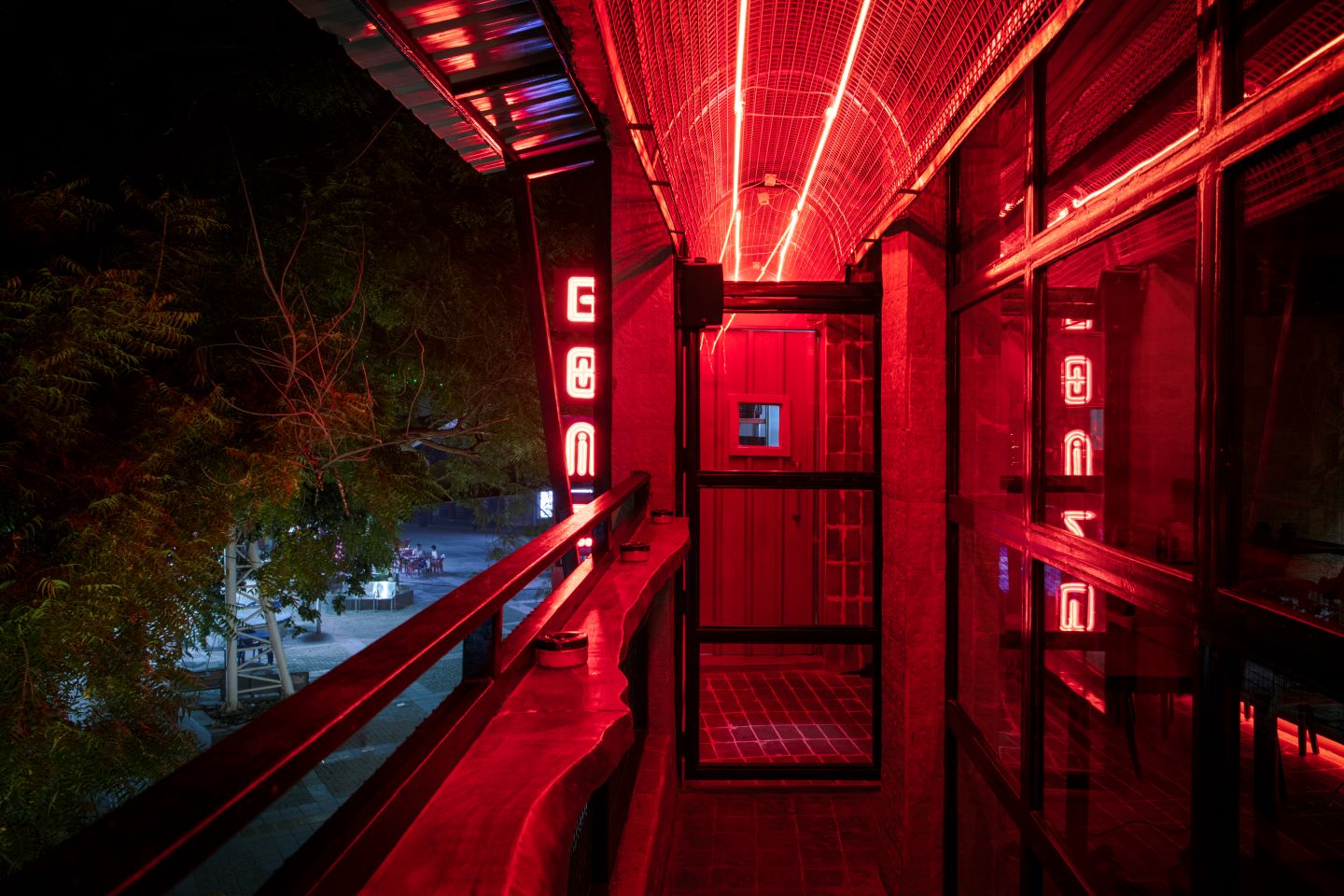
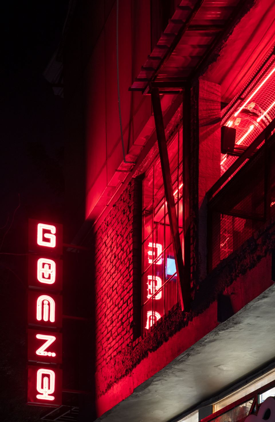
Warm, inviting and ever invigorating, crimson lanterns, or akachochins have served as significant signifiers outside the widely celebrated street bars of south-east Asia since time immemorial. “Hence, it was only befitting that they found their place symbolically in the design of this space. While traditionally these paper lanterns might have apprised passersby about the existence of an izakaya within an establishment, eye-catching red neon lighting is our modern interpretation of this historical element,” explains Manav Dangg, principal architect, Studio Dangg. The prominent red signage for the bar along with the external neon lights catch the potential patron’s eye by engulfing a strata of the facade in scarlet hues. These neon lights, that mark the upstairs balcony and pique the bystanders’ interest, are reminiscent of popular streets lined with outdoor bars.
A conspicuous and ubiquitous theme throughout the bar is the stark contrast drawn between the exterior and the interiors, both literally and figuratively. This philosophy emerges from the closely knit relationship that izakayas have with yokochos, the cramped alleyways that are lined with dozens of these bars. One cannot exist without the other, with yokochos undoubtedly being a silent yet essential part of the experience of visiting an izakaya.
 The civil intervention
To maximise the influx of natural light, and forge a generous break-out area overlooking the street below, a balcony was carved out along the length of the space. The facade along the balcony was punctured with fenestrations in the form of French windows, allowing the external walk-way to have unencumbered visual access to the interiors. The balcony was scooped out of the facade’s volume, in lieu of fabricating a cantilevered one, thereby creating a visual void marked by a shift in materiality and lighting in an otherwise existing bare-faced building facade.
The spatial configuration
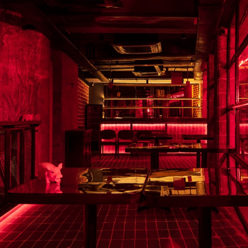
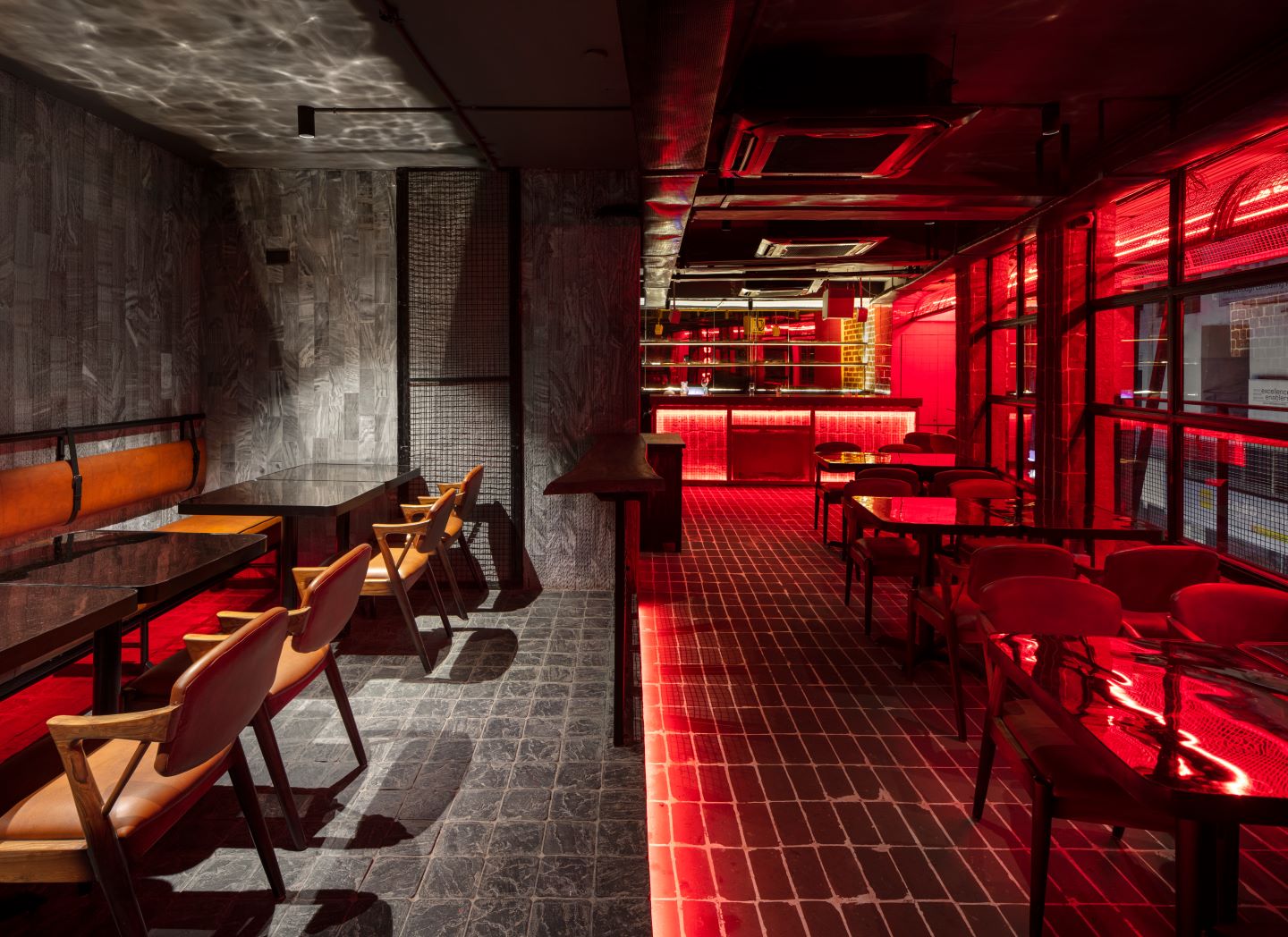
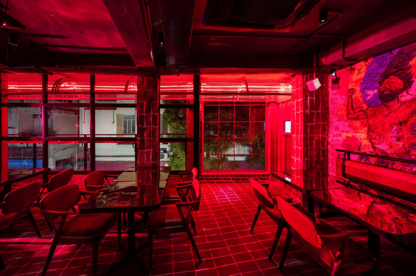
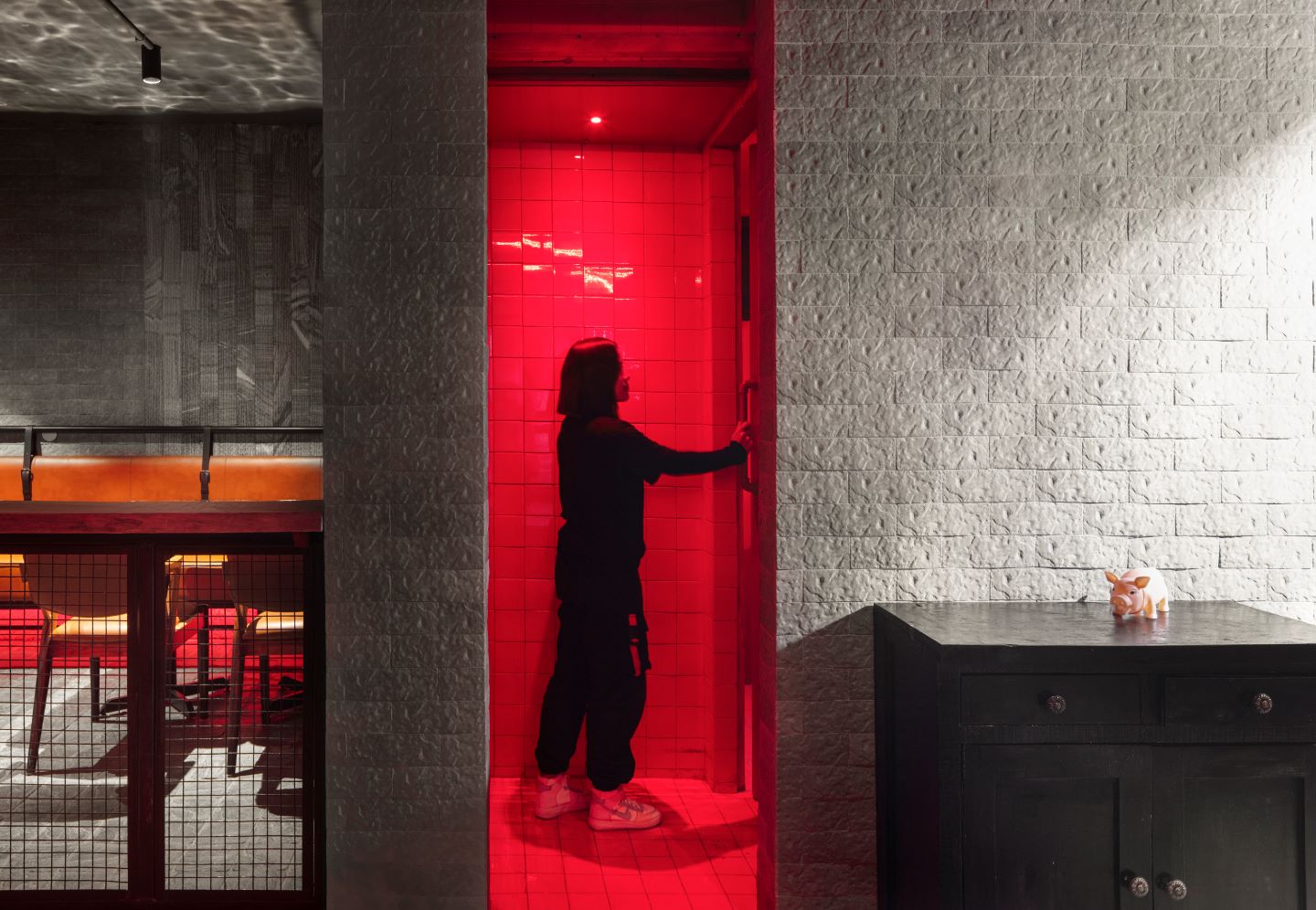
As one walks towards the entrance, they are greeted by external pavers and crude grey brickwork, a visual that is instantly shed the moment they walk into a stairway flooded with red lighting. It is here in the experience that one starts to subconsciously associate shades of grey with everything external, and the colour red with internal spaces. Upon ascending the staircase, this theme is reinforced through a grey entrance upstairs, allowing a peak into the stark red interiors, and acting as a fitting threshold between the transition and the internal space. The interiors of the bar evoke a feeling of being out in the street, and the polarity of the two materials in use surprisingly blurs the line between the indoors and the outdoors.
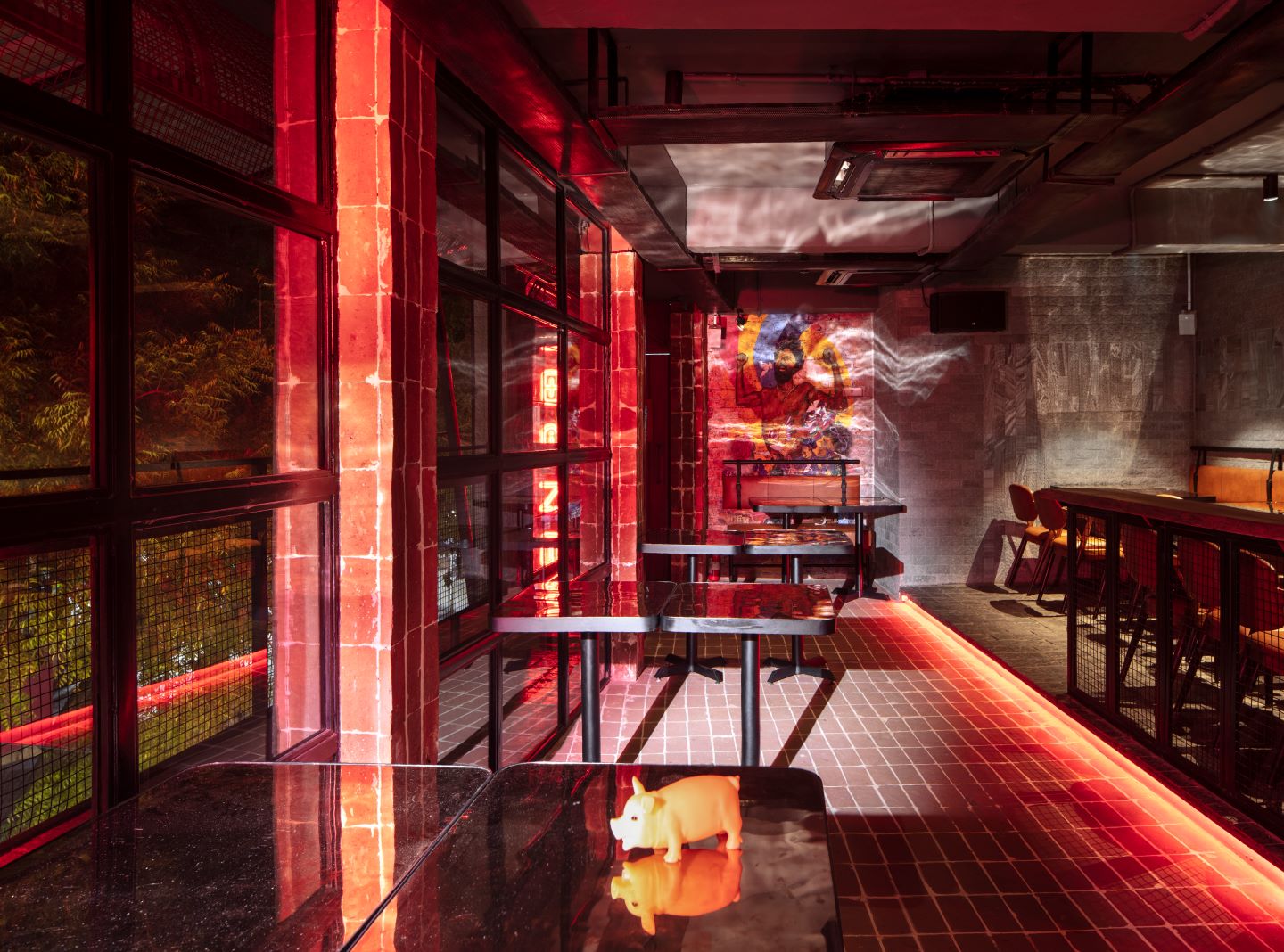 The transition between the actual indoors and the outdoor balcony is yet again marked by a change in materiality, as well as French windows with an industrial aesthetic — drawing attention to the fact that traditional izakayas are constructed with whatever supplies the beneficiary may find. Another element used to re-establish this chain of thought is the usage of steel overhangs, or chajjas in the balcony. Meandering through the space and into the balcony, one can’t help but notice the linearity of the elevation being advantageously used to create an external walkway. As the visitor leans along the railing, their experience is one of viewing the entrance of an izakaya from the street, replete with the feeling of being washed over by the warmth of the akochochins outside. In this case, this impression is created by lining the tunnel-like ceiling above with an array of red neon lights.
 The material and colour palette
The two palettes used — grey and red — consolidate the space, yet hold their own. Each material is lauded in its raw form, untainted by cladding or layering. “This is a conscious decision, amplifying the intent of bringing out the ad-hoc nature of the design of authentic izakayas, which are embellished and held together with makeshift materials, and could crop up anywhere in the urban fabric,” explains Manav.
The interiors of the bar evoke a feeling of being out in the street, and the polarity of the two materials in use surprisingly blurs the line between the indoors and the outdoors. While the supposed “outdoor” segment is marked by the use of grey pavers and rugged wall cladding, exposed brickwork champions the great indoors. The seemingly small footprint might seem like a challenging constraint, however, in this case, it is used as an advantage to emphasise the cosy and casual nature of the space. As one would expect to find in a street eatery in Japan, the furniture is scattered in an informal manner, inviting visitors to leave the woes of their busy work day behind and relax.
 The highlights
Apart from the bold choice of materials, another element that stands out in a multitude of ways in different areas is the play between solid and void, casually concocting “sneak-peak” moments. While the cut-out created for the balcony gives bystanders in the street an inviting peep into the startling interiors, a similar impact is made by an internal portal created to access the restrooms. In this case, the continuity of an ashen elevation is punctured by a cuboid plastered with red tiles.
The challenges
“The seemingly small footprint might seem like a challenging constraint, however in this case, it is used as an advantage to emphasise upon the cosy and casual nature of the space,” says Manav.
Fact File
Project: Akachōcchin
Client: Gonzo
Location: New Delhi
Area: 1,000 sq ft
Principal architect: Manav Dangg
Add a Comment