
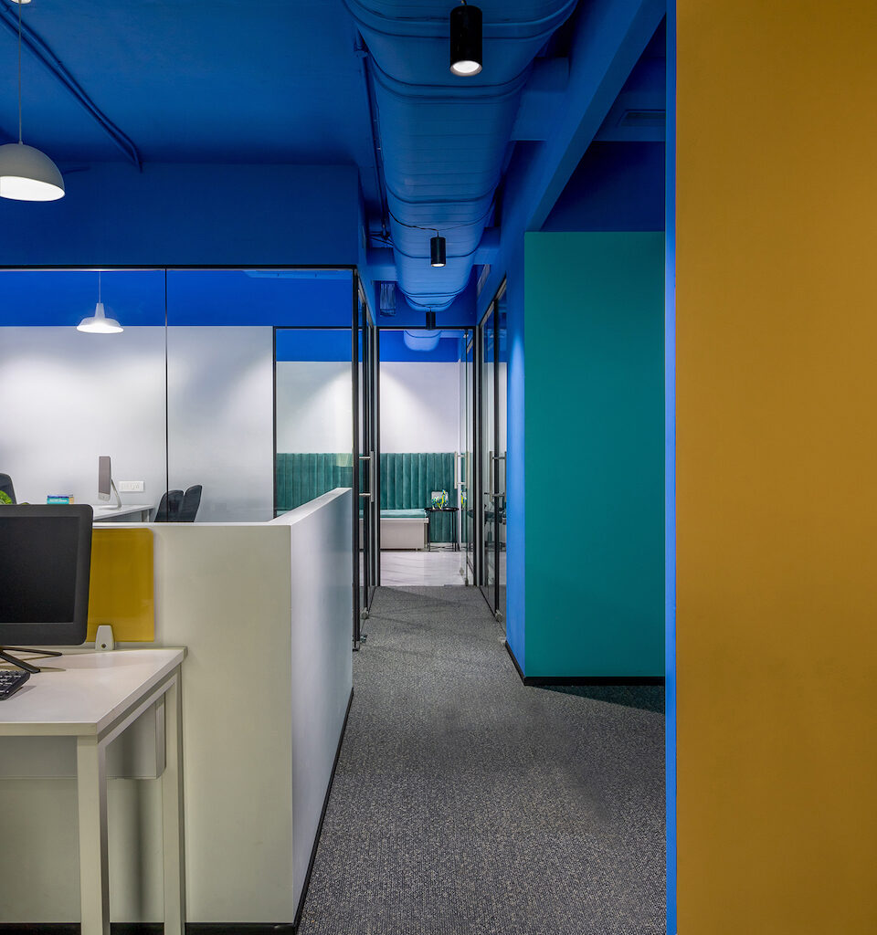
RN Design inject a youthful, effervescent vibe through impactful hues on all manner of expanses — even on the ceiling!
Curated by: Rupali Sebastian
Photographs: What We Click; courtesy RN Design
The site
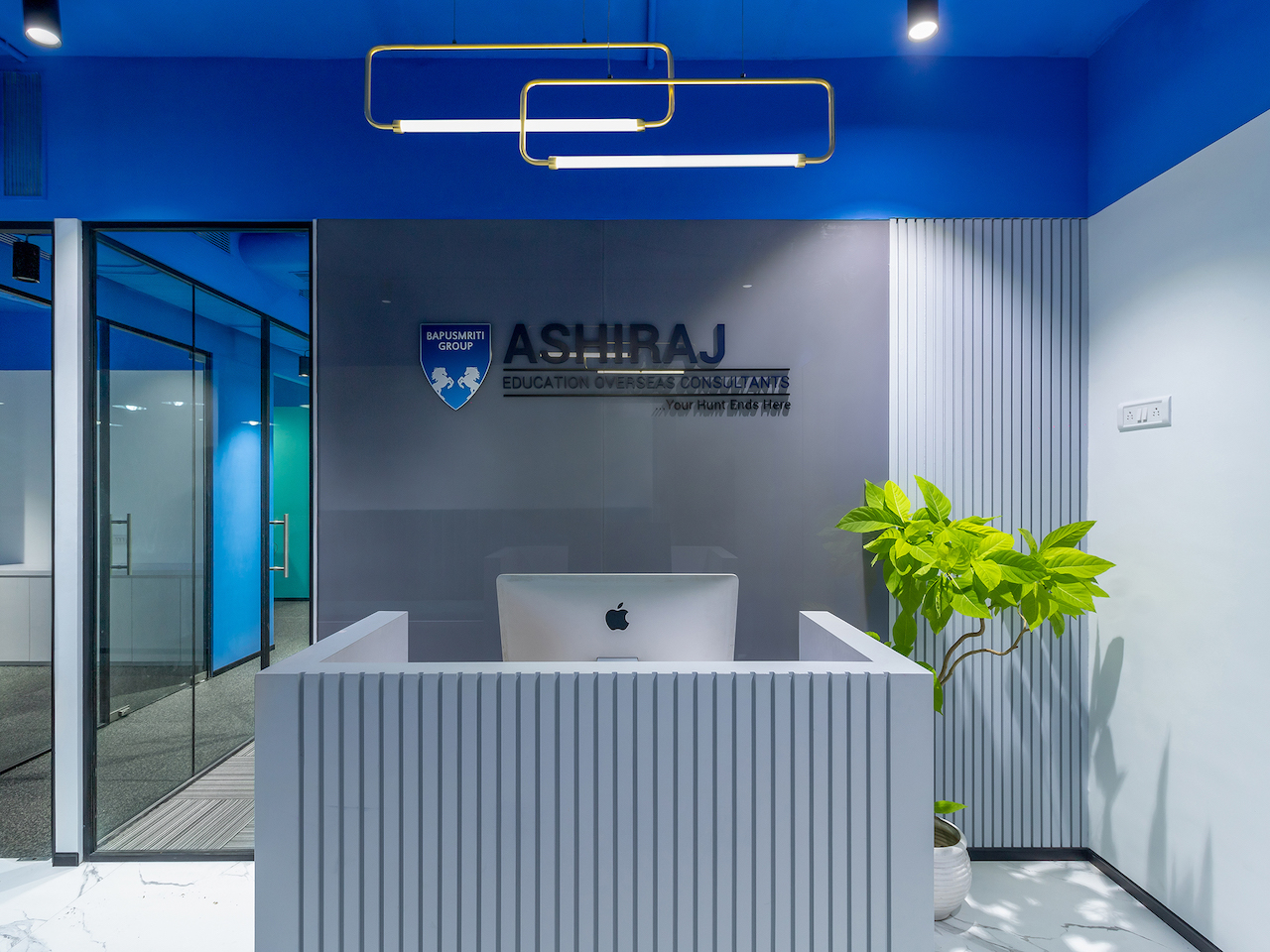
The project involved designing an office for a leading education consultancy that offers support to students to secure admissions in different colleges from across the world. The site is located on the second floor of a commercial building in suburban Mumbai city.
The brief
Considering the age demographic of the people who would be visiting the place, the client asked for a workplace that was “young and bright,” says Rohit Gupta of RN Design. The team turned to colour, one of the most versatile design tools, to translate this brief into a spatial entity. “We used colour everywhere: the walls, the furniture, the ceiling…” discloses the young architect.
The spatial flow
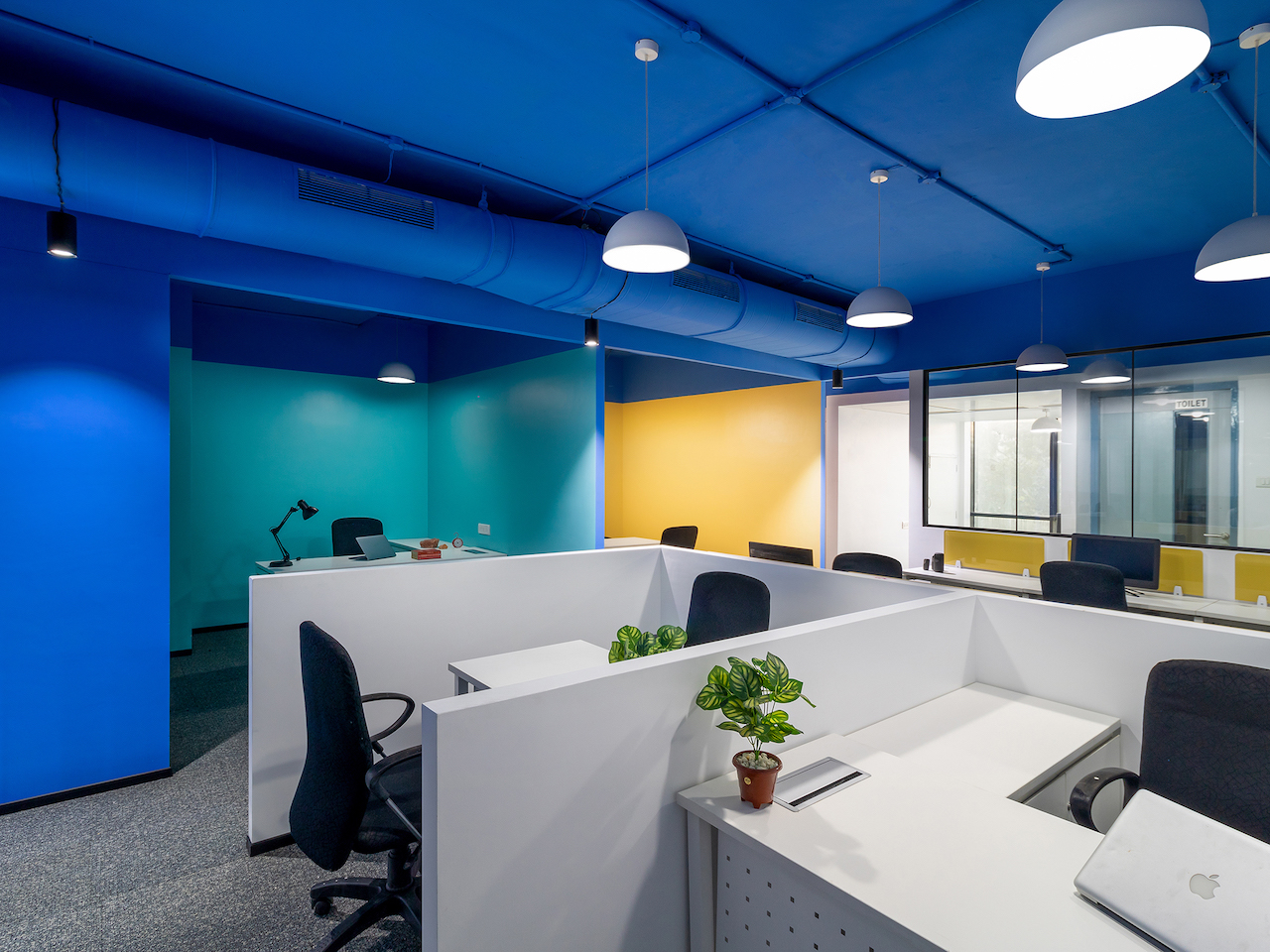
The 1.150-sq-ft, rectangular volume is apportioned into functionalities strung on either side of a central corridor space arising at the reception area. The conference room and three open interactive areas for counselling lie on one side, while the MD’s cabin, two cubicles and a general workstation area are positioned across the central aisle. The back-of-the-office areas and the washrooms are tucked away to the rear.
The material and colour palettes
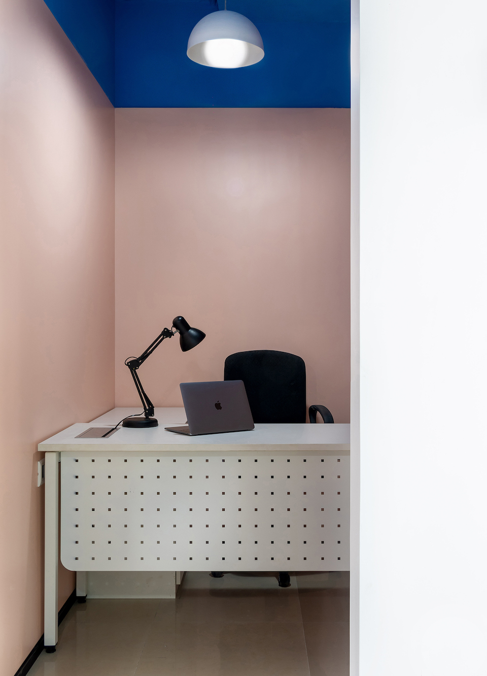
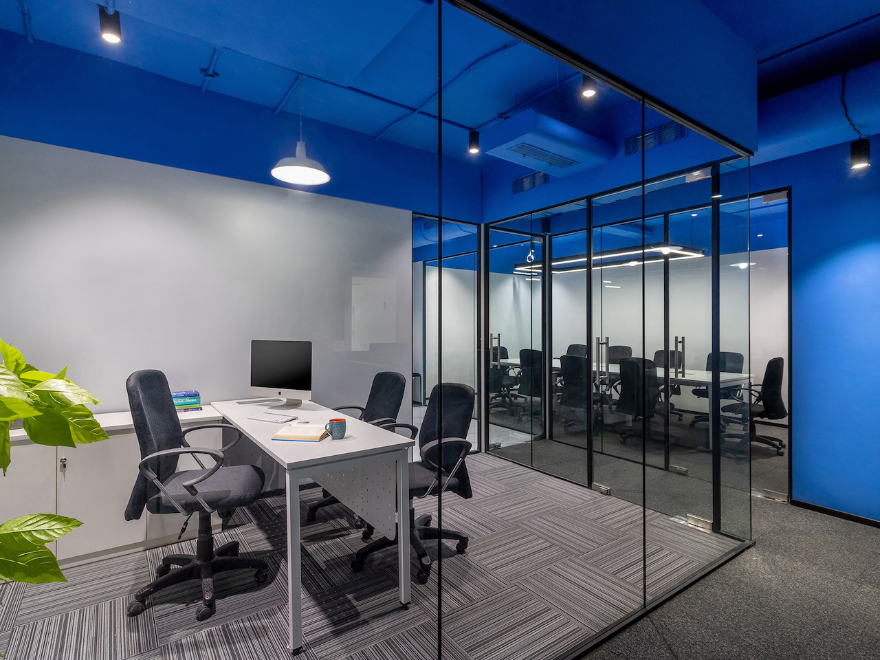
The director’s cabin is dressed in neutral grey, while the three counselling rooms, separated by gypsum partitions, sport light-hearted hues of pale pink, turquoise blue and lemon yellow. The corridor that connects all the rooms has also been kept neutral, to allow the colour all around to pop through. Overhead, the ceiling expanse, including AC ducts, is coloured a lovely cerulean blue.
The challenge
“There was a mess of cables and conduits of neighbouring offices routed through these premises,” reveals Rohit. “Removing them was quite a challenge.”
The highlights
“It’s definitely the blue ceiling,” enthuses the architect. “The client was insisting on the conventional grey and white combination, but we decided to take the risk of going blue. We convinced the client, and also pointed out that it reflected the colour of the company logo. After the project was completed, the client was quite happy!” This particular aspect also represents the learning for the team as well. “It gave us the confidence that we can use such bold colours in our future projects as well!”
Fact file
Project: Ashiraj Education Overseas Consultants
Location: Mumbai
Area: 1,150 sq ft
Principal architect: Rohit Gupta
Design team: Puja Gupta
Add a Comment