The Colour Me Happy project designed by Kaviar Collaborative in Mumbai is filled with playful, unconventional and eccentric elements, yet is calm and peaceful. Step in…
Curated by: Deepa Nair
Photographs: Ishita Sitwala; courtesy Kaviar Collaborative

The brief
The Colour Me Happy project — designed by Kaviar Collaborative — dwells inside a 1,220-square-foot apartment in Mumbai. The brief required Kasturi Wagh and Vineet Hingorani, principal architects, Kaviar Collaborative, to retain the kitchen counter, flooring, bathroom tiling and fittings provided by the builder; and to incorporate (by refurbishing) old furniture and artefacts which the family had collected overtime. Through its design, Colour Me Happy is an attempt to encapsulate the emotion of cheer within the confines of a home. The apartment unapologetically thrives as a fun, bright mood lifting device (read, space). With its exposed red pipes, printed fabrics, colour block walls, the house exudes a sense of calm and playfulness and doesn’t shy away from being unconventional and eccentric.
The design intent
The architects wanted to re-envisage a drab, stock builder apartment as a colourful abode of solace in the heart of Mumbai. Through its design, Colour Me Happy is an attempt to encapsulate the emotion of cheer within the confines of a home.
The spatial configuration
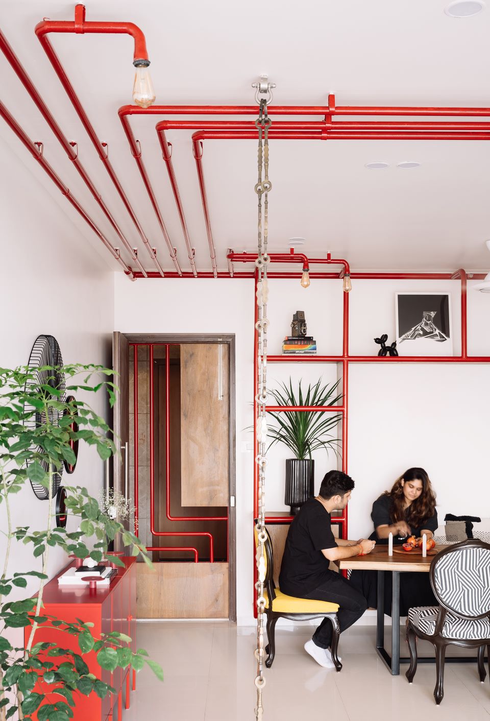
A large red fire hydrant pipe floating above is the first eye-catching element one sees after stepping out of the elevator. The pipe strangely branches into smaller ones which flow down to become a safety door of the apartment. Through the openings between the pipes of the safety door, one gets glimpses of a bright and vibrant space that frames the Bandra-Worli Sea Link at a distance. The red pipes follows you inside the apartment too, and flows on the ceiling of the open living-dining space. A few of these branch out and spread over the living and dining spaces to end as light fixtures that inhabit delicate filament bulbs. To the left, some more of these red pipes bend down from the ceiling to form a kind of vertical shelving unit with free floating wooden storage boxes between them. A larger, central box defines a bench seating for the six-seater live edge wooden dining table that doubles up at times as a cosy reading nook. The dining table is surrounded by four refurbished round back chairs with bright yellow and black and white stripped upholstery.
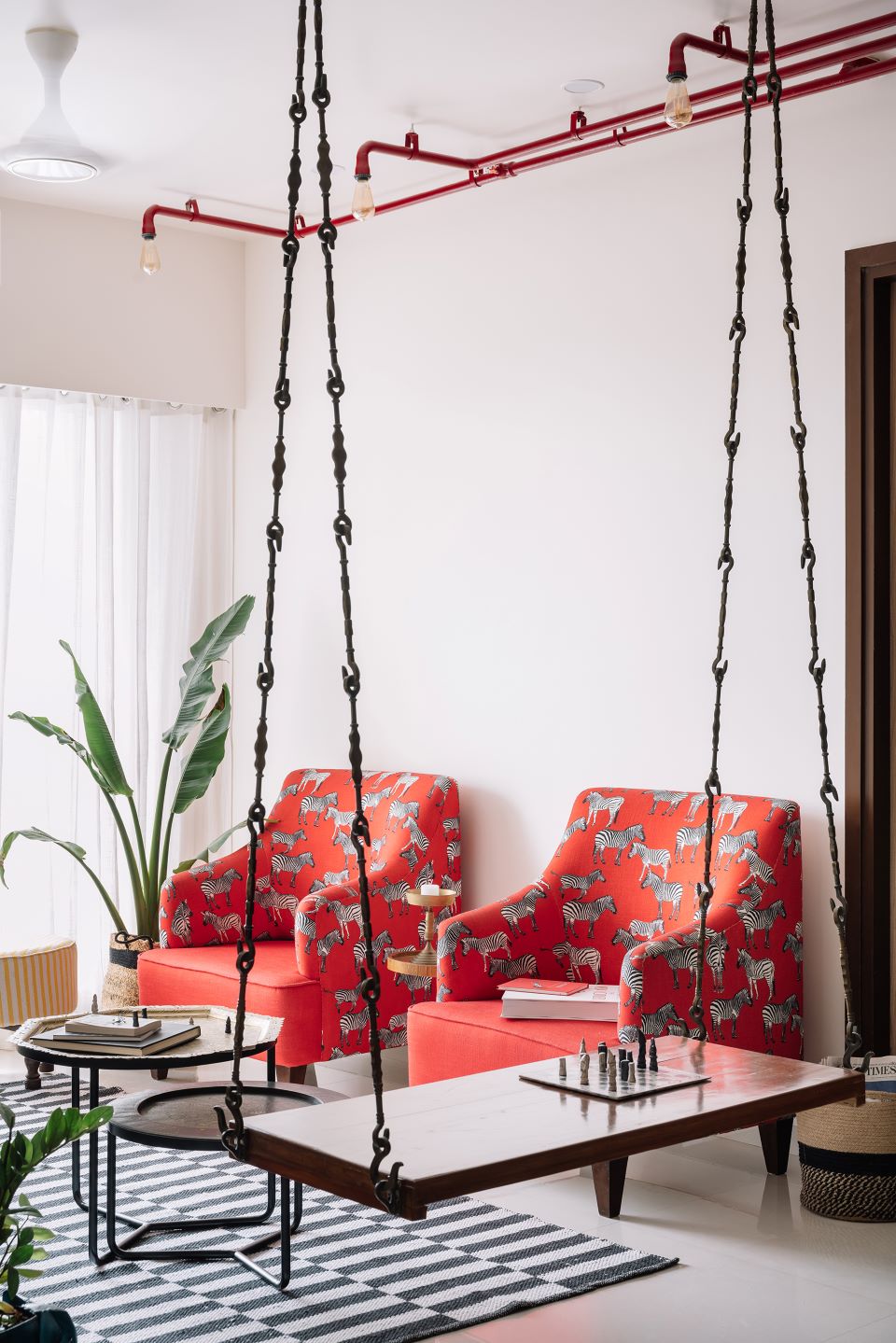
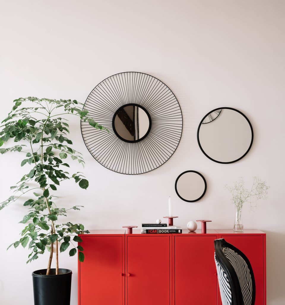
A look straight ahead reveals a long red metallic entrance console with three circular mirrors of varying diameters hung about it that reflects bits and pieces of the house as one meanders through it. A medium height China Doll plant right next to the red console brings freshness. A sleek wooden refurbished swing with brass chains separates the living and dining spaces. Being a backless swing helps de-clutter the space and allows the field of vision to extend through the living towards view outside and acts a two-sided seating element.
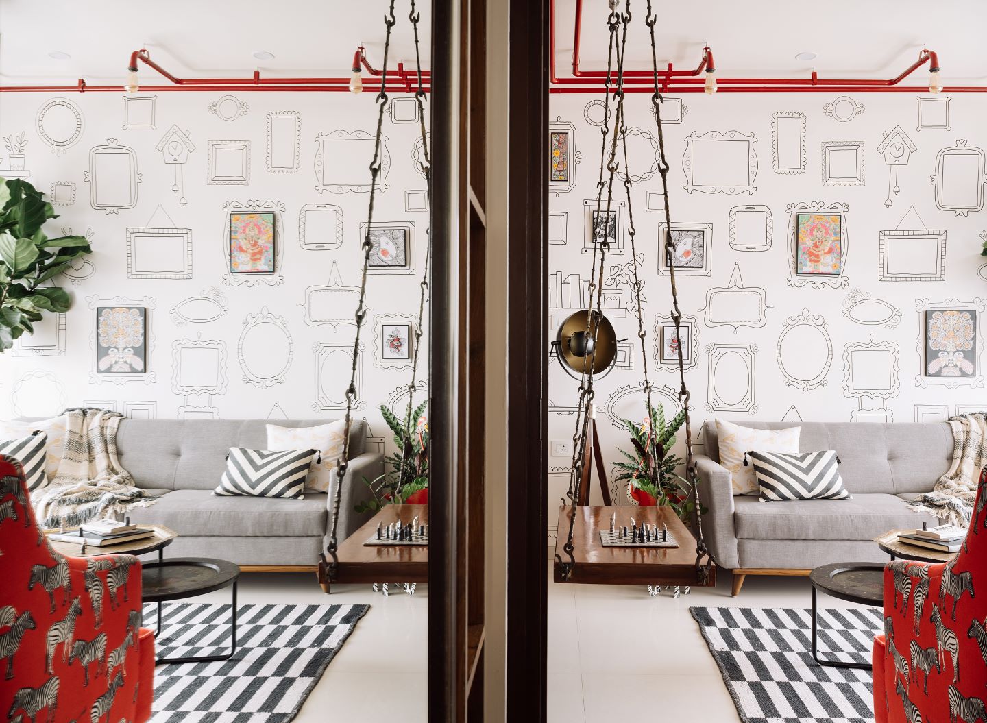
A bit of quirk is brought into the living space via two large refurbished armchairs with a customised zebra print red fabric that complements the overhead red pipes. To balance the colour scheme, a solid block grey colour sofa is placed directly opposite these armchairs. A black and white rug, and refurbished brass and black metal coffee tables ties the space together. Pure white sheer linen curtains brings in soft natural light, while full height Fiddle Leaf Fig and Travelling Palm plants adds freshness.
The architects somewhere in the middle of the design process discovered that the lady of the house is a closet artist. This propelled the idea of setting up the living space as a canvas to showcase her art. The wall behind the grey sofa is converted to a gallery-esque feature with the help of an artist. “The minimal 2D line work provides a guide of reference to hang the client’s colourful art work while also being a conversation piece. Colour also pops through the living and dining spaces via the use of patterns, prints and textures in soft furnishings. An innate liking to animals is clearly visible through the space via smaller artefacts, planters and fabrics,” says Kasturi.
A large sliding wooden barn door in the passage reveals a solid grey kitchen with a quirky black and white chevron patterned backsplash. The delicate black linework of the backsplash mimics the gallery wall from the living space. Open wooden boxes are sprinkled through the kitchen and connect with the floating boxes in the dining console.
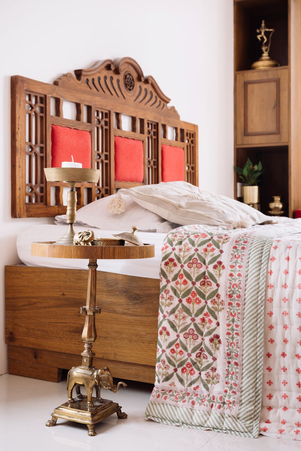
The grandparent’s room is a confluence of all things old and new. Numerous old pieces are upcycled to create new furniture and decor thereby preserving the emotional attachment to items gathered over decades. One of these pieces is the head board of the bed, which once used to be the back rest of a swing. Another upcycled element is the elephant bed side table that once was a lamp. A deep red Pichwai art work adorns a wall within a curved arch as a memento from the old days.
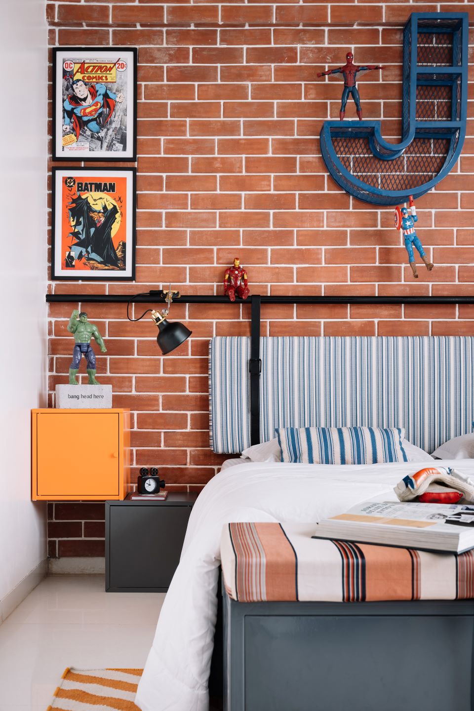
Bricks, metal and action figures dominate the kid’s room to create a robust and a raw palette. The brick wall acts as the piece de resistance of the room and provides the perfect backdrop to all the crime fighting action figures and posters. A customised headboard involves the usage of a floating black metal pipe fixed only on the ends to the wall. This black metal pipe supports an upholstered head and lighting fixtures. Keeping the playful element intact, the full height wardrobe unit doubles up as a blank canvas for doodling or solving a mathematical problem. A puncture in the wardrobe unit inhabits the all-blue study desk.
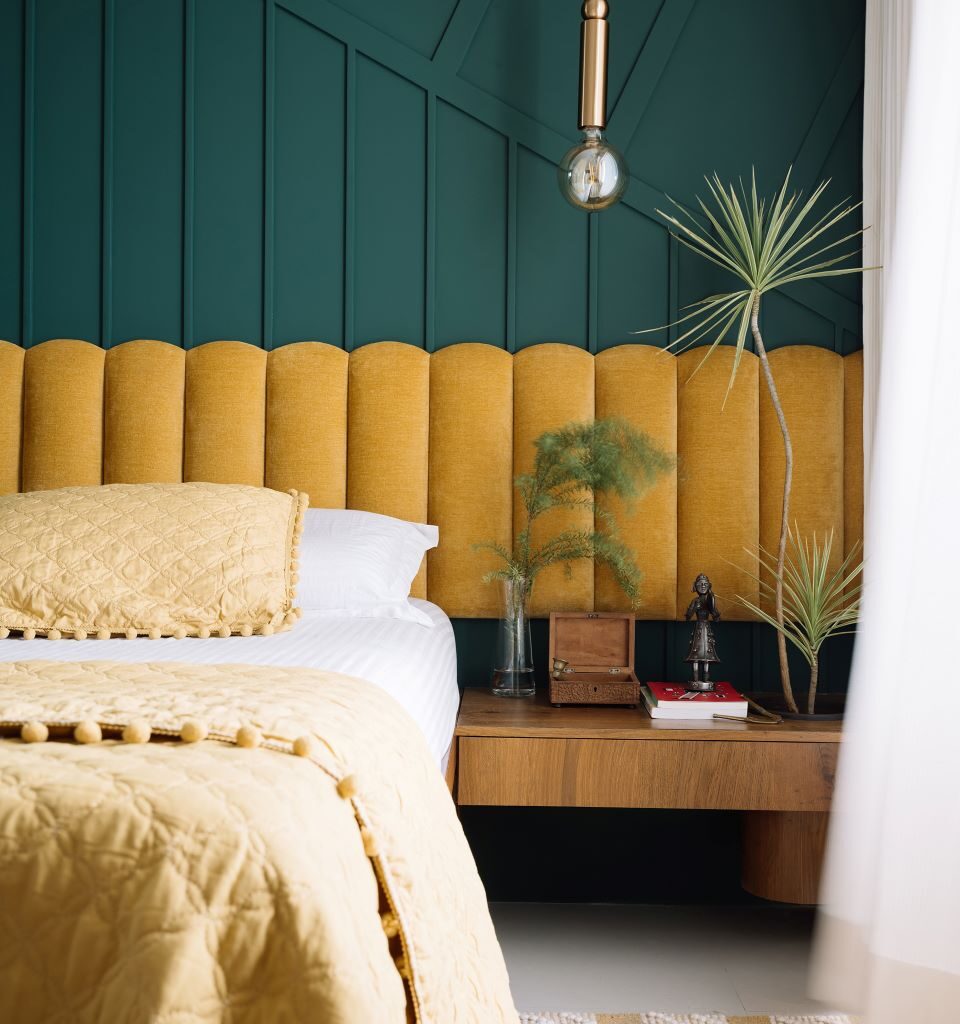
The master bedroom, unlike its namesake, is surprisingly not the biggest room in the apartment. Mirrored full height wardrobes help add visual volume to the room while enhancing the light quality. Deep green and mustard colours elegantly champion the master bedroom to create an intimate and snug atmosphere. Delicate brass elements add a touch of glamour to an otherwise bold room.
The material palette
This 3BHK house radiates in colour — at times with a sense of subtlety but mostly in a bold manner. Common spaces, such as the living and dining, are largely covered in whites with pops of colour via red pipes, soft furnishings and the client’s artwork. Alternatively, the three bedrooms turn towards a cosy atmosphere with colour blocked walls and neutral fabrics, drapes and rugs. Here, the proportionality of colour to whites is inversed in comparison to the common spaces. Textures of wood, metal, prints and patterns are layered throughout the home bringing all the spaces together and striking a sense of balance. An innate liking to animals is clearly visible through the space, jumping from artefacts to fabrics to wallpapers to even planters.
The challenges
“As architects, we tend to seek cues and visual guides from the site and context. The code approved red fire-fighting pipe, though functionally an important safety feature, is usually regarded as an eyesore and finds itself hidden away from plain sight. The three pre-existing red pipes were seen as whimsical linear elements that ran through the periphery of the space. They had a certain dynamic and distinct quality to them which we felt had the potential to be exaggerated. These are visually replicated to form a series of red pipes flowing across the ceiling and walls to form functional elements like a seating in the dining space, open shelving for artefacts and a lighting feature branching through the living and dining spaces.
Although it was fun experimenting with pipes and turning them into functional elements, our first challenge was to convince the family members to not only retain these industrial exposed firefighting pipes, but to also add a couple of more to the group. In terms of technicality, figuring out hidden wiring for light fittings within the pipes, fabrication details between the new pipes, and the existing live firefighting pipes without the option of welding and hiding pipe end conditions were a couple of challenges we enjoyed working out,” explain the architects.
The takeaway
“When you’re given a project brief in school- you are both the designer and the client. In the real world, you are merely a designer who has to sell your design to your client who, may or may not have the same liking or beliefs as you. We were very lucky to have clients who understood our vision and trusted us with their home. Never in school did we think, clients would play big role while designing but now we know how important it is to make designing a home a collaborative process,” asserts Vineet.
Fact file
Project: Colour Me Happy
Clients: Pritesh Sheth and Bhumika Sheth
Location: Mahim, Mumbai
Area: 1,220 sq ft
Principal architects: Kasturi Wagh and Vineet Hingorani
Add a Comment