Studio Dot plays with forms and colour to liberate a compact, wedge-shaped space.
Curated by: Rupali Sebastian
Photographs: Avesh Gaur; courtesy Studio Dot
The site
Wedged into the dense urbanscape, Kala Kriti enjoys a wide front, facing a huge cluster of trees guarding it against the harsh sun. The rear is fairly narrow when compared to the front and gives the site a wedged form that later became the most exciting directive for the team at Studio Dot which was entrusted with the task of interpreting the brand’s principles and vision into a spatial entity.
The design vision
The store was envisioned with the primary intention of enhancing experiences and prioritising human interaction with the built environment. In a commercial context, this meant strategically using design elements to elicit an emotional connection to a brand and immersing occupants in the narrative.
The design response
The brand, which creates bespoke gifts and hampers, requires users to spend hours discussing their vision, and their requirements. “To ensure comfort, we had to negate the impact of the gradually narrowing floor plate,” say architects Shubhit Khurana and Anmol Arora, principals of the studio. “Instead of going with a linear approach, we introduced curves and tried to create smaller envelopes of varied sizes and functions. The two prominent curves linked to each other formed the most crucial spaces i.e., the discussion space and a private cabin.”
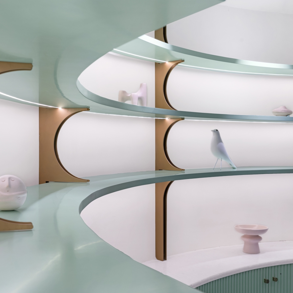
The chromatic and material directions
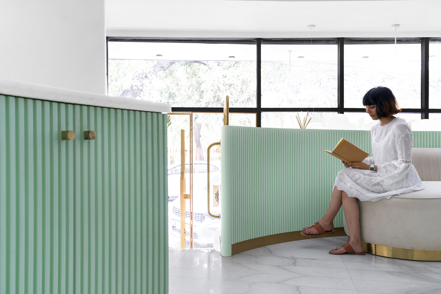
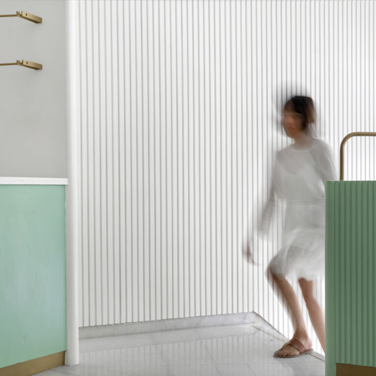
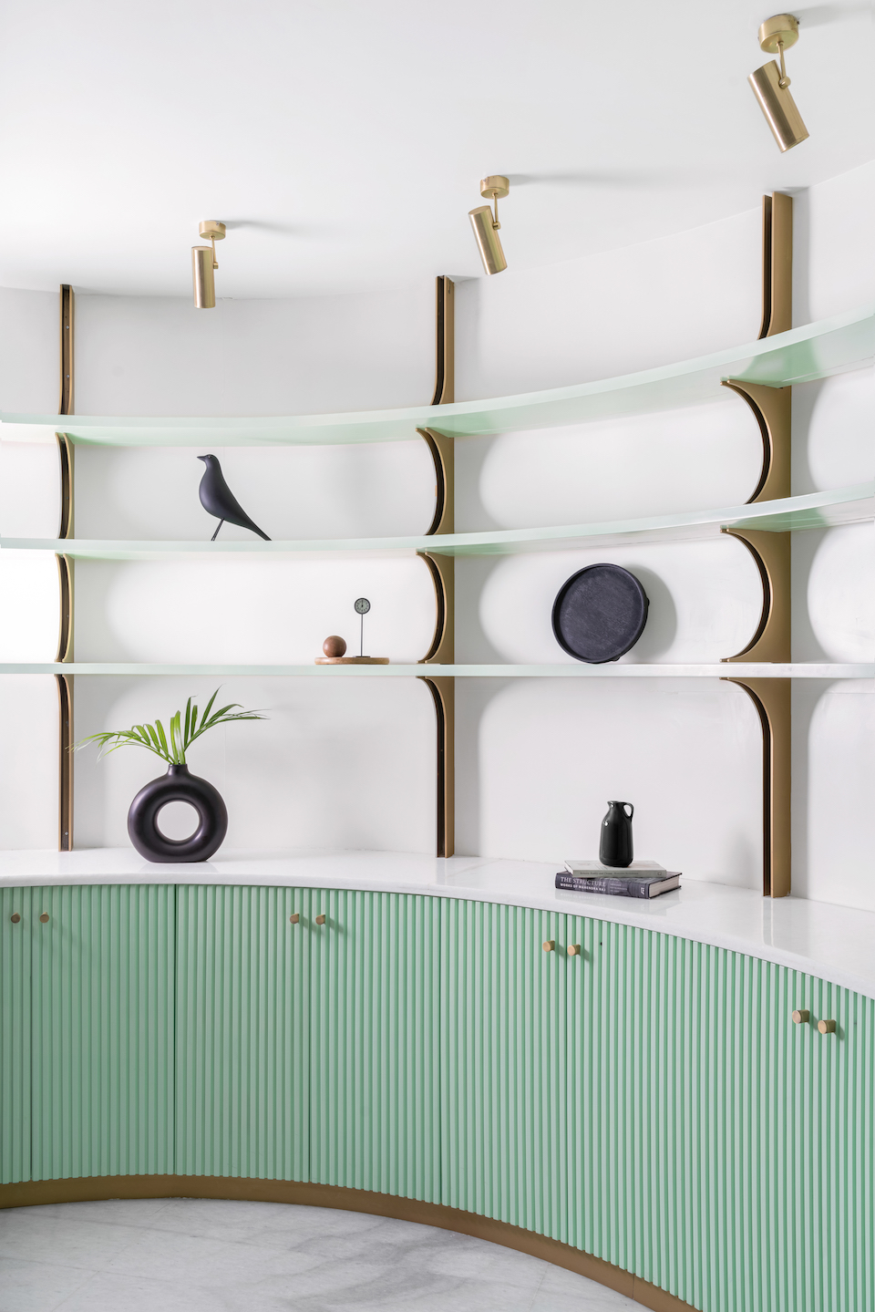
To further tone down the dominating volume of the site, a careful colour and material palette was chosen. This articulation also became important as the products are constantly changing, are colourful, and come in a variety of sizes. That means that the space had to correspond to it and the elements could overpower the colour spectrum. Hence, the decision was to stick to white, brass, and a pastel green. “The brass helped refine the space, whereas the very pastel green mellowed the curves,” elucidates the duo.
The zoning
The floors were divided into two functions – the upper ground as their experience centre and the lower ground floor as their workspace. The workspace was kept purely functional, pushing for ample storage, flexibility, and ease of workability. The upper ground was, however, envisioned as a cosy envelope.
The spatial flow
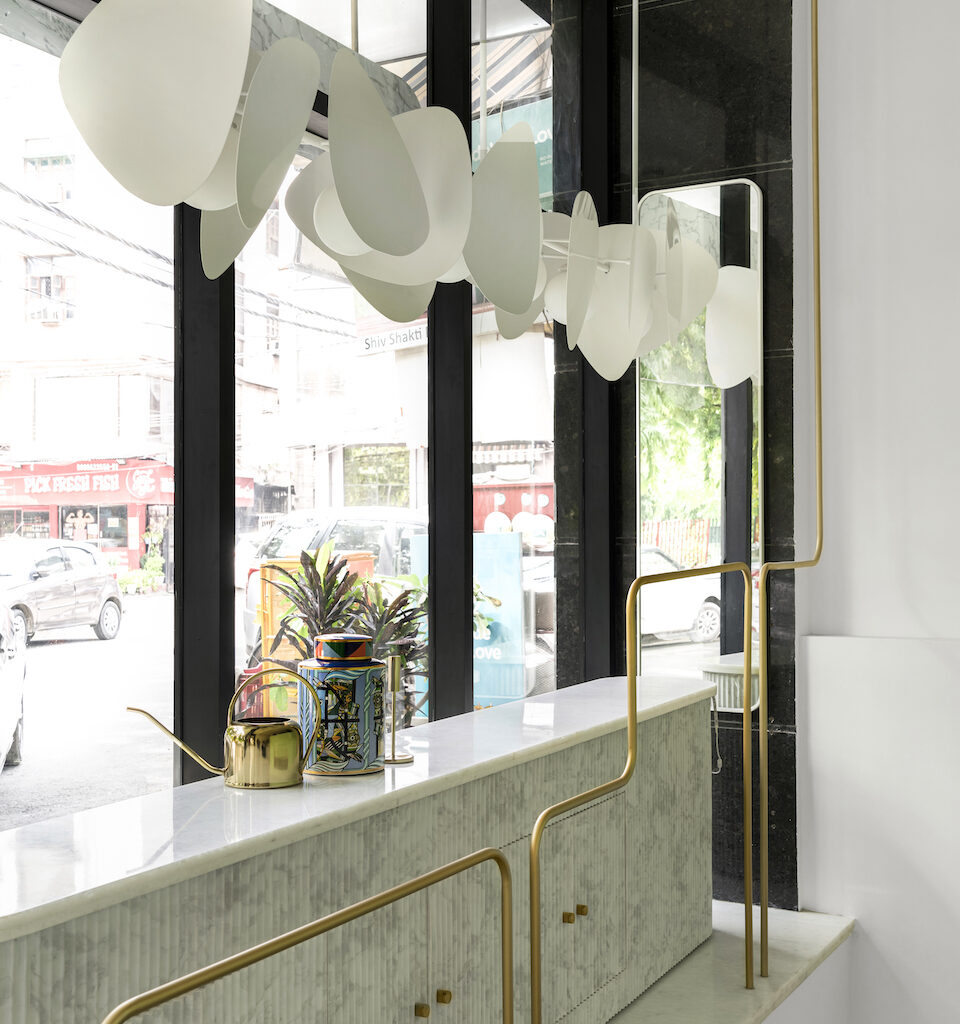
Stepping into the store, on the left is an elegant display window, showcasing a hefty console covered in fluted Carrera. Washing the beautiful console is the “finny one”, arrays of metal fins tied delicately together with steel cables to further assert the focus on the products. These two together add consistency to the front façade and in turn become the identity of the brand.
Up four steps, curves take over the space to form the display shelf and the back to the seating area. This area, envisioned as a living space, is highlighted using a wide variety of complementary materials. A cantilevered coffee table with a splash of black in the marble overhangs a fluted white circular table. The wicker chair further pushes the delicate material palette of the space. The triangulated curved back for the seating houses two depressions, one for the fresh greens and the other for utilities. The brass grab bar further reinforces the function in the space. The shelves beautifully sit on the custom-cut brass brackets. Underneath the shelf, concealed storage, the grooves are spaced out and adjusted to further complement the curve. The central glass table has two roles: one to act as counter space for mock-ups, and two, the sides open up to extend the storage for envelopes and other smaller items.
Moving through the corridor, on the right is the boss’s cabin, lined with curves on both sides. The negative spaces here become towers of functional storage; the bean-shaped table tries to break away from the forms; the pendant shines on the work desk. Right behind the personal cabin is the pantry, clean and crisp, with brass dots taking over the subtle shutters. Towards the rear end is the staircase to further floors, and right under it is the very modest washroom.
The challenge
“More than the wedge, it was the washroom that troubled us,” admit the architects. “The compromised volume then became an opportunity to explore materials and forms. The white marble dado helped us add a reflection. The cylindrical pedestal basin with spline bars adds drama, delicacy, and function to the space.”
Fact file
Project: Kala Kriti
Location: New Delhi
Area: 650 sq ft
Principal architects: Shubhit Khurana and Anmol Arora
Design team: Anmol Arora and Vidhi Chopra
Add a Comment