
Kerning Design Co crafts graphical representations, creates an industrial environment and weaves in the brand’s core principles into the design of the new workspace for sneaker and apparel brand, Ludic.
Curated by: Deepa Nair
Photographs: The Space Tracing Company; courtesy Kerning Design Co
 The brief
Kerning Design Co was approached by sneaker and clothing brand, Ludic, to design a dynamic workspace for a staff of 20-25 people in a 1,700 square foot area. The client’s brief requested Kerning Design Co to imbibe the brand’s value disciplines of honesty, curiousness and playfulness into the design. They also wanted an industrial looking space that is not too rigid and hierarchal in order to generate a work culture that promotes collaborative working. The brand identity was an important anchor to be incorporated into the visual language of the space.
 The design intent
The design keeps in mind the cue points of the brand’s value discipline and the client’s inclination towards an industrial-looking space, to create an aesthetic which is more refined than raw. The primary materials used to produce this mood includes birch ply, metal and concrete. “The design challenge in this project involved understanding the brand story and strategy created for Ludic. We wanted the space to be a strong reflection of the brand ethos, graphical language and aesthetic which makes it a perfect example of marrying different design disciplines into one space,” explains Sanjana Shah, principal designer, Kerning Design Co.
 The civil intervention
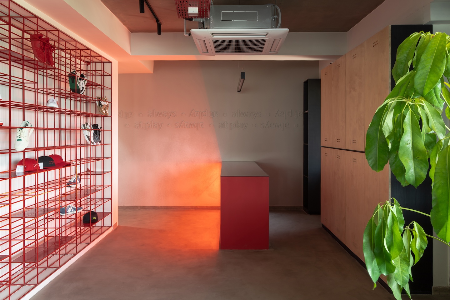
The site came as two units of commercial spaces nestled on the 12th floor of a newly made corporate building in a bustling neighbourhood in Ahmedabad. The first task was to combine the two units by pulling down the common wall, to create a larger space. This move also allowed the design to leverage the view of the city skyline that one of the spaces overlooked. The existing tiled floors were topped with micro-topping to give a monolithic concrete like finish. A pantry was added and the bathrooms were redone and finished with red mosaic tiles so that it vibes with the rest of the space.
 The spatial configuration
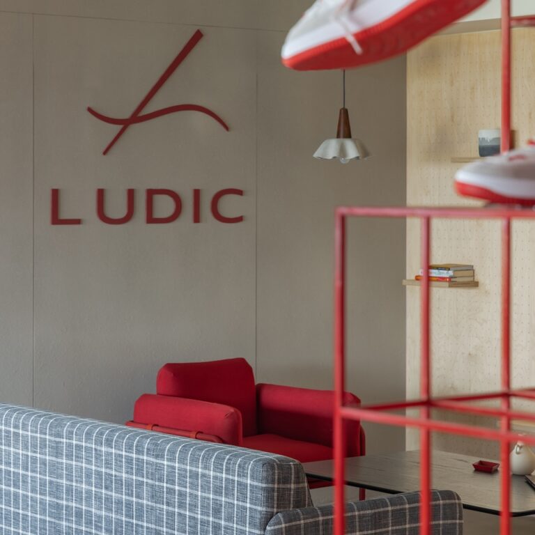
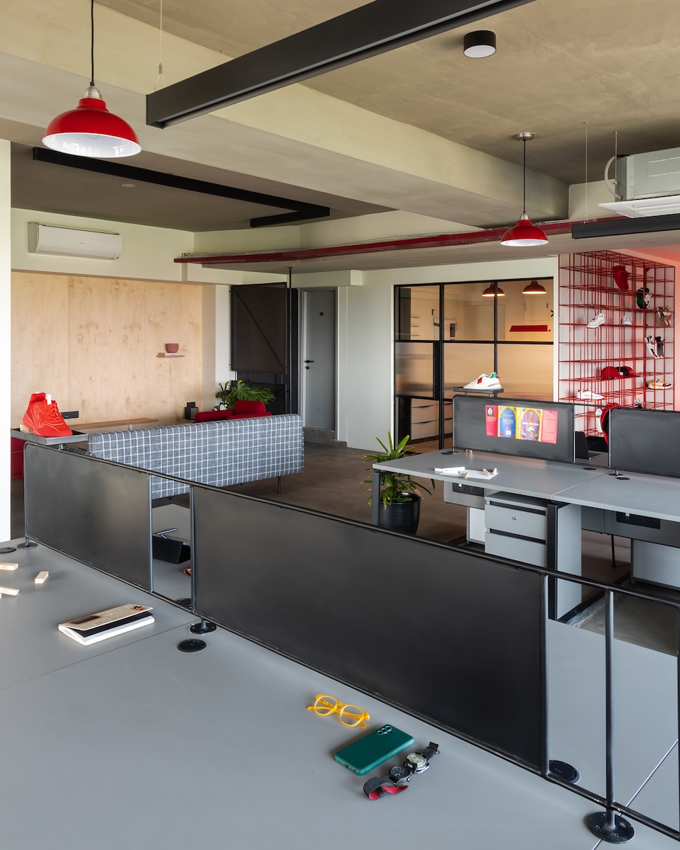
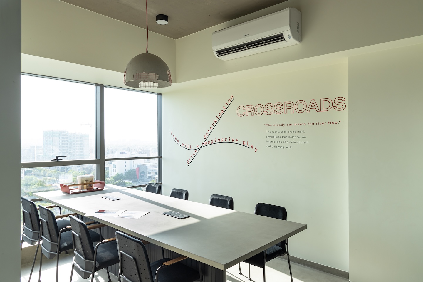
Right at the entrance, one is taken in by the striking red reception which is visible from afar. On a wall opposite the reception is a red metal grid which acts as a display for the products. This further leads to a large bullpen where the employees can work in collaboration. Adjacent to this open space is a lounge which acts as a casual meeting spot, and doubles up as a recreation space for the users to read, play games or have a coffee break. The founder’s cabin overlooks the bullpen on one side, and has a view of the city skyline on the other. The other two managerial cabins, a conference room and the accounts department are all located adjacent to the bullpen so as to maximize on the space, and also keep natural light flowing through the office.
 The material palette
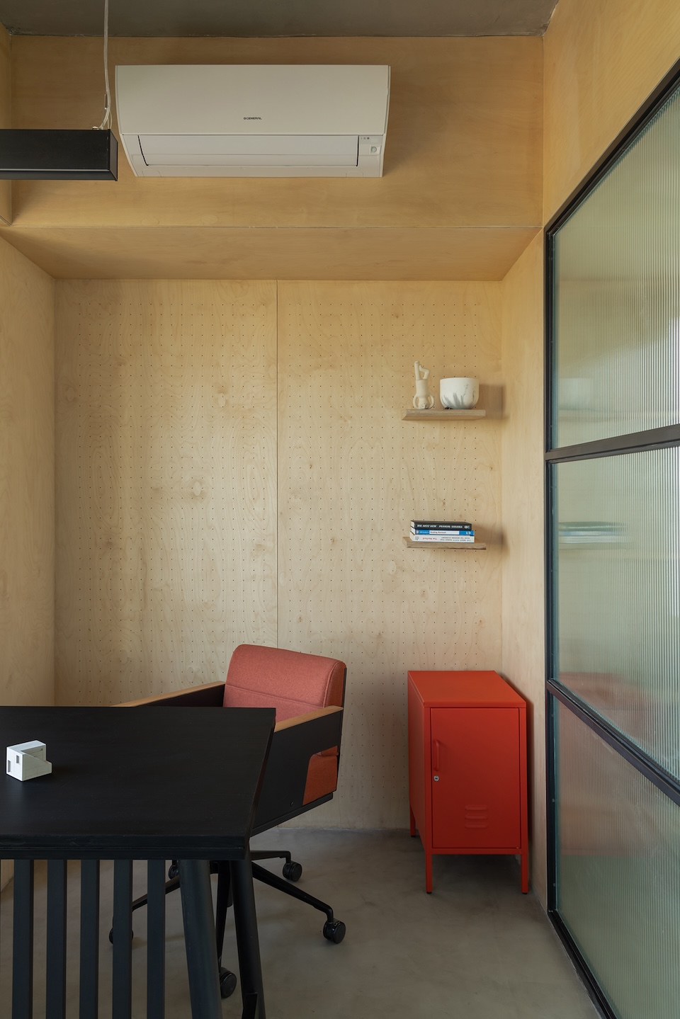
Sanjana wanted to use all the materials in their natural form in a refined manner to create a modern industrial language in the Ludic office. The birch ply with small locker details were custom-made to add to the industrial character. Perforated metal sheets and fluted glass were used in the partitions to ensure privacy wherever necessary. The separators on the work tables are made using metal sheet instead of the usual soft boards to adhere to the material palette and design language. The concrete micro-topped floor and light hue of the birch balance the use of red and black in the space. The maximum amount of red was used around the reception area which was largely a transition space in this case. The sneaker display has also been done in a red frame which keeps it visually light.
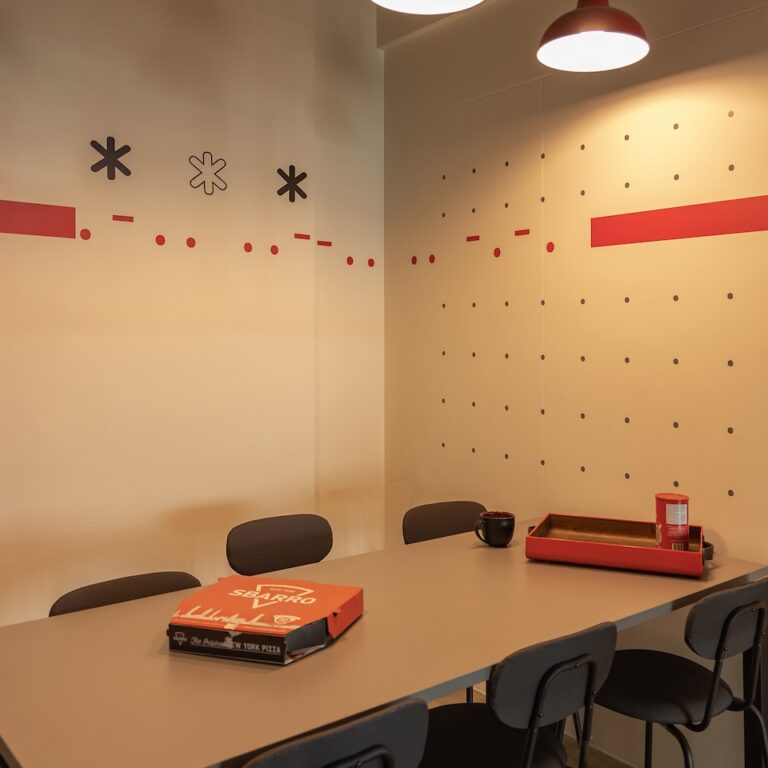
 The furniture was custom-made by Spin which follows a similar brand aesthetic and thus was a perfect fit. Red reflectors and concrete lamps sourced from Lap and Dado and Oorja, respectively, add to the character of the space. The services on the ceiling were kept exposed and was painted in a red hue to balance the use of the brand colour, albeit subtly. “We tried to incorporate graphical references of the brand story in the conference space as well as the common areas. The pantry also houses a graphic which is actually the name of the brand in Morse code,” says Sanjana.
The highlights
“We are well aware that it’s the smaller details that make the design. The subtle reference of metal lockers is visible on every storage element in the space. A miniature peg board detail was also done over the birch ply to add texture to the space. The red metal frame display becomes the focal point when one enters the space since it tells a story about the brand,” shares Sanjana.
Fact file
Project: Ludic Head Office
Location: Ahmedabad
Area: 1,700 sq ft
Principal designer: Sanjana Shah
Add a Comment