
Design Dialogue creates a European aesthetic-infused backdrop for a classic Indian couture label.
Curated by: Rupali Sebastian
Photographs: Monika Sathe & Ricken Desai; courtesy Design Dialogue
The design intent
The craft of designing the retail space has evolved from solely depending on the store’s commercial needs and aspects to tastefully creating a physically immersive experience for the customer. “Our approach to design was to truly reflect the richness and exquisite detail of the label’s designs itself while maximising the advantages the site offered,” say architects Prashanthi N and Amulya G of Design Dialogue, the brains behind a retail experience.
The built-form
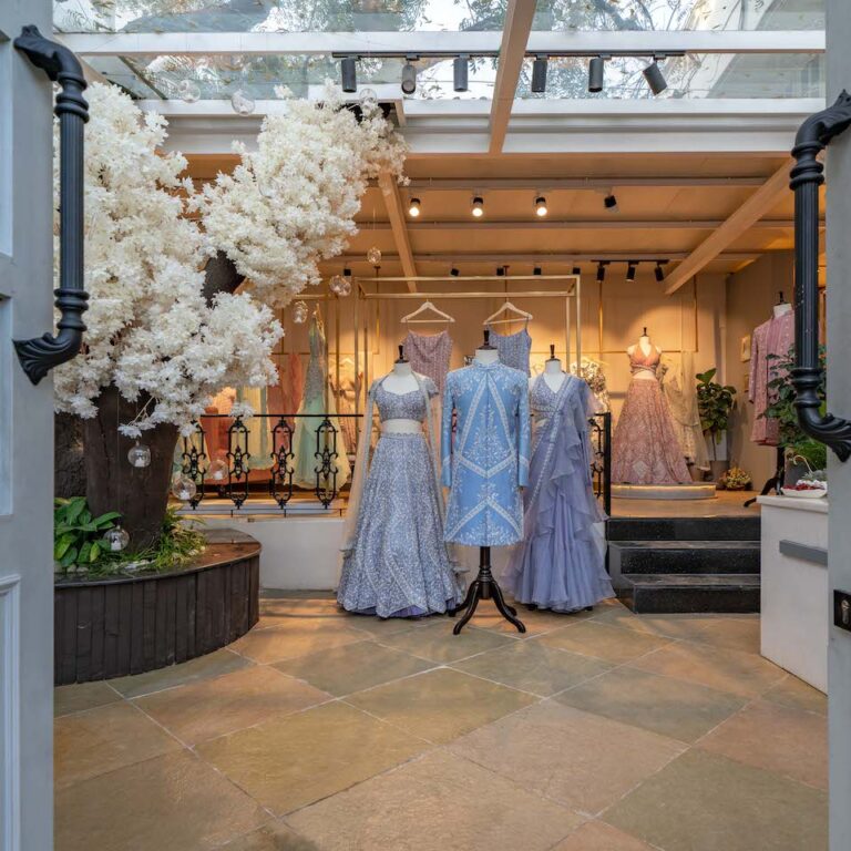
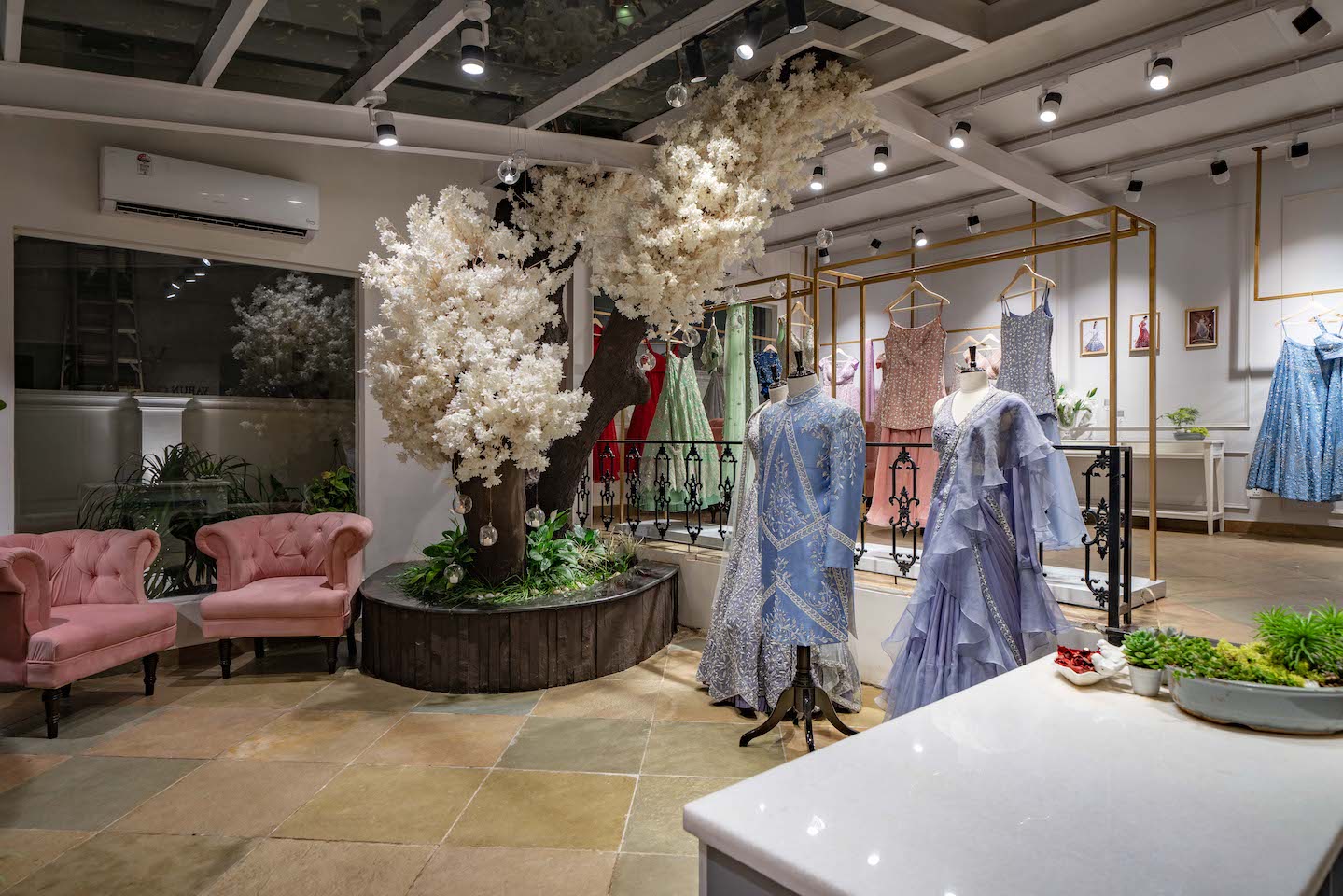
“The integral element of design was weaving the interiors and the built-form around a magnificent tree that stood on site while keeping the spatial planning simple yet effective,” say the principals of the Hyderabad studio, who believe in bringing a fresh perspective to design in surprising and engaging ways. The store emulates a glass enclosure that lets the interior spaces interact with the ever-changing light and beautiful patterns formed by the tree’s foliage on the skylight ceiling. This creates an illusion of expansiveness and builds a visual relationship between the indoors and outdoors.
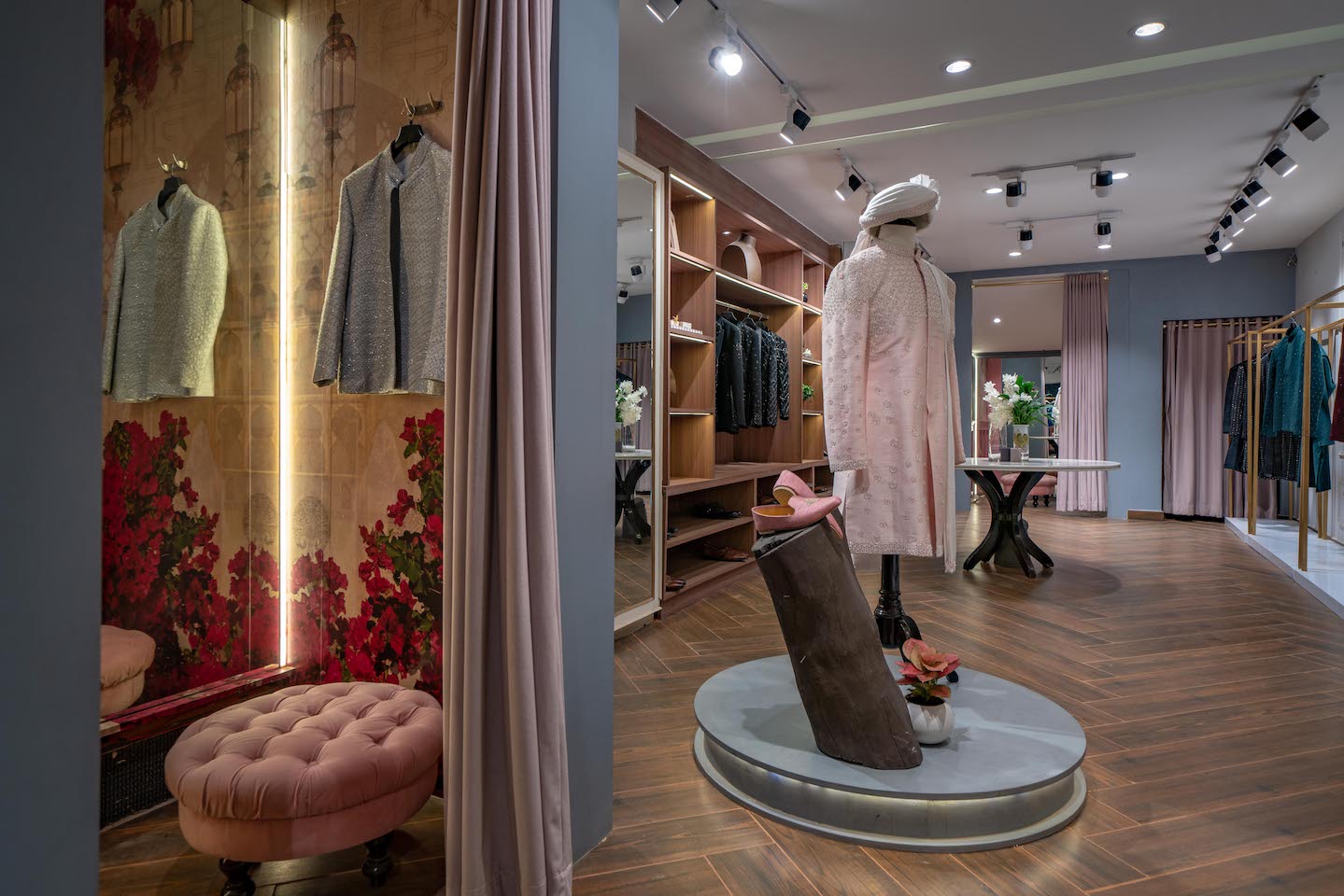
The spatial configuration
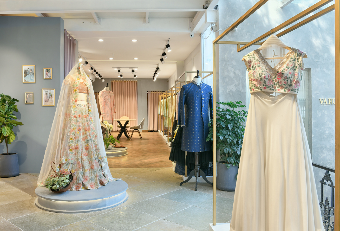
The retail space comprises two bays, a small one and its longer, linear partner, arranged in the form of an L. As one steps into the boutique, the flow of the space is defined with the reception and the waiting area at the helm (accommodated in the smaller volume) and segregated zones of the menswear and womenswear on the raised (bigger) level.
The chromatic and material directions
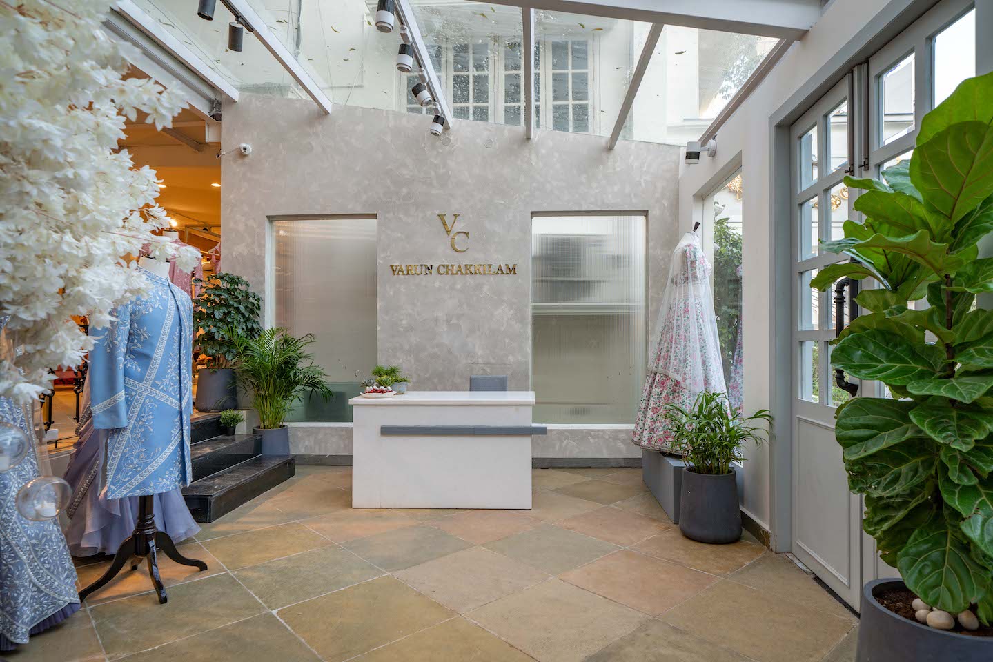
The eye-catching storefront with its ivory and periwinkle colour story paints a picture of elegance and offers a glimpse into the label’s signature sensibilities. The slight influence of European boutique style accents the classic Indian identity of the label represented by the use of natural textures and rawness of materials. Continuing the use of natural elements, the texture palette used in the interiors consists of stone, wood and earthy tones which are balanced by the subdued colour palette of pastel greys, blues and dusky pinks. The wainscoted walls in pastels encapsulate the contemporary while the customised brushed-brass clothing racks, ornate wrought-iron railing, and dainty glass and gold accents in the accessories imbue the essence of old vintage. Display rods hung from the exposed ceiling add a sense of scale to the space. The grey and yellow Tandur stone lends the required rugged feel to the space only to enhance the feel of antiquity and minimalism to bring out the label’s designs.
Fact file
Project: Varun Chakkilam Label Project
Location: Jubilee Hills, Hyderabad
Area: 2,000 sq ft
Principal architects: Prashanthi N and Amulya G
Add a Comment